Mapping Nine-Billion Data Points in 2 Days
This past week at Calculated Systems we have been working one of the most meaningful applications of our technology to date. With publicly available data we have been spending our time building maps of COVID-19 health risks by analyzing local traffic patterns.
It’s been challenging and exciting, and we wanted to share a little bit of the magic behind the work of taking 9 billion data points and turning that into consumable information that quickly shows locations where potential COVID outbreaks can happen.
Of all the projects I have worked on before, from analyzing real time data on a breast cancer assay to reduce yield loss from 14.5% to 1.6%, or helping a spectrometer company build a real-time data pipeline to the cloud to access spectrometer data in seconds instead of days, this is probably the most challenging and impactful projects for Calculated Systems.
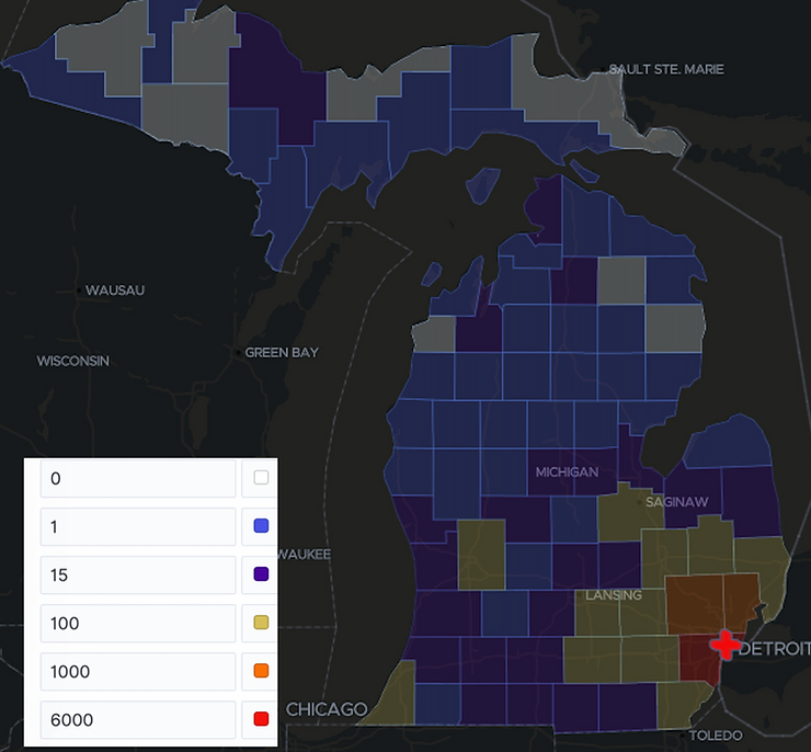
First we used the publicly available CDC data on the COVID-19 outbreak – data reflected in the map below. The colors represent the number of cases per county.
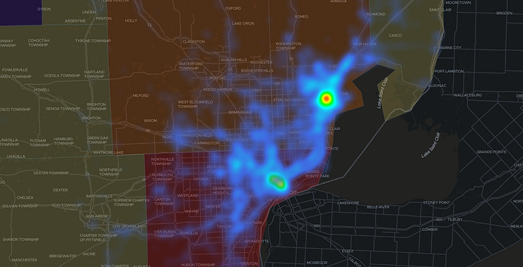
Then, to map the potential risk of COVID-19, we analyzed 9 billion rows of data representing 5 days of mobility data. It took us two days to do it, and based on the data (anonymized before we could utilize it), we were able to map local traffic patterns in and around hospitals – for example, around Henry Ford Hospital and Detroit Medical Center in Michigan.
This allowed us to map mobility patterns to and from hospitals overlaid with the CDC data. With this, we can easily generate patterns to represent locations where potential COVID outbreaks have been identified.
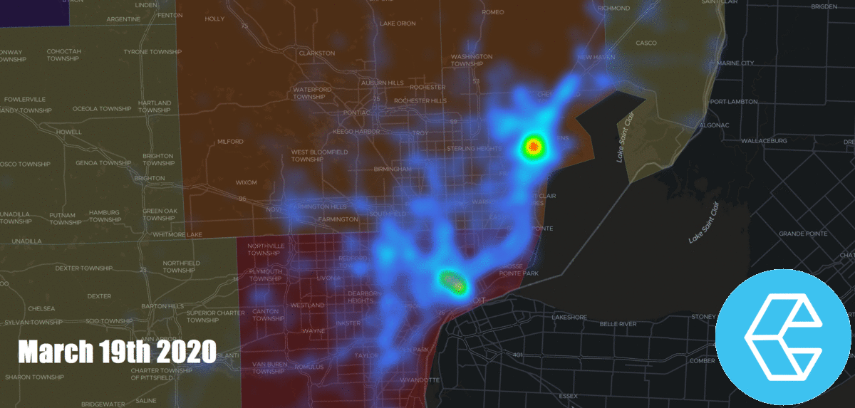
For example, the following map shows traffic patterns to and from the hospitals on March 19, 2020. Blue indicates light traffic, green is medium traffic flow and red is high volume of traffic for that day.
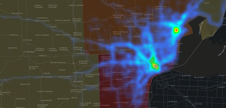
The next map shows traffic patterns to and from the hospitals on March 22. 2020. Comparing Mar 19 and Mar 22, you can see the increased flow to and from the regions near the hospitals.
You can also dynamically see the mapping overlays between traffic and CDC data via this clip for March 19 – March 23, 2020.
Understanding the traffic patterns with the most up to date mobility and CDC data can help local governments mitigate risk and provide useful insights into the impact of effectiveness of social distancing.
Related article here: Michigan company maps data to analyze, predict spread of coronavirus
BTW: For those who haven’t heard of us before, Calculated Systems was founded by experts in Hadoop, Google Cloud and AWS. Calculated Systems enables code-free capture, mapping and transformation of data in the cloud based on Apache NiFi, an open source project originally developed within the NSA. You can try Apache NiFi in the cloud yourself.